
Job growth across the decades
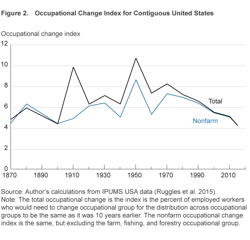
How much change in occupations do we typically see in 10 years?

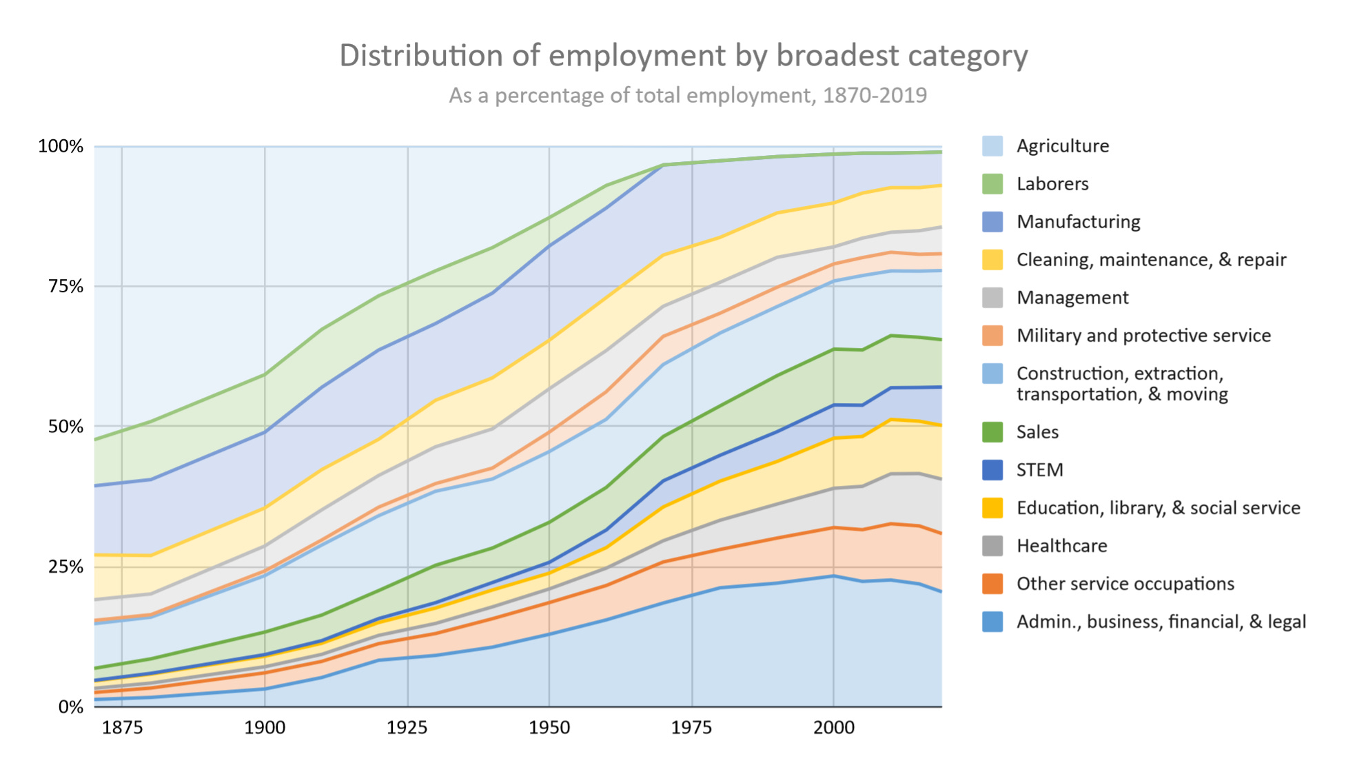
In writing my history of the American workweek, I have shared quite a few charts like these showing how the percent of workers in each type of job has shifted over time.
We can get somewhat of a sense of how quickly occupations are shifting over time from these, and indeed Joel Elvery at the Cleveland Fed did an analysis concluding that the fastest turnover in terms of types of jobs happened during the 1900s and 1940s. According to this analysis, turnover in the 2010s was historically low.
But these charts only look at shifts across major categories, and not necessarily shifts within categories. And the definition of what’s counted in one category vs. another has shifted over time, and adjustments need to be made to account for where the Census data is non-comparable.
Diving this deep into this Census data was exhausting— it made me question why I was doing this rather than spending more time traveling during my year off! But finally I finished, and here are the results:
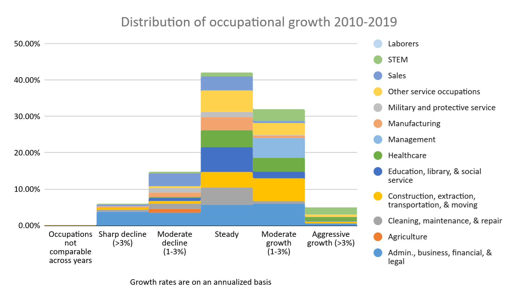
The 2010s, like most prosperous decades during peacetime looked like a pretty normal bell curve, with a little bit of a skew to the right. Since we are looking at growth relative to all job growth, everything should average out to zero. So, seeing more jobs in “moderate growth” than “moderate decline” suggests that the few jobs that are declining are dropping more quickly relative to their category (i.e. a heavier “tail” to the left).
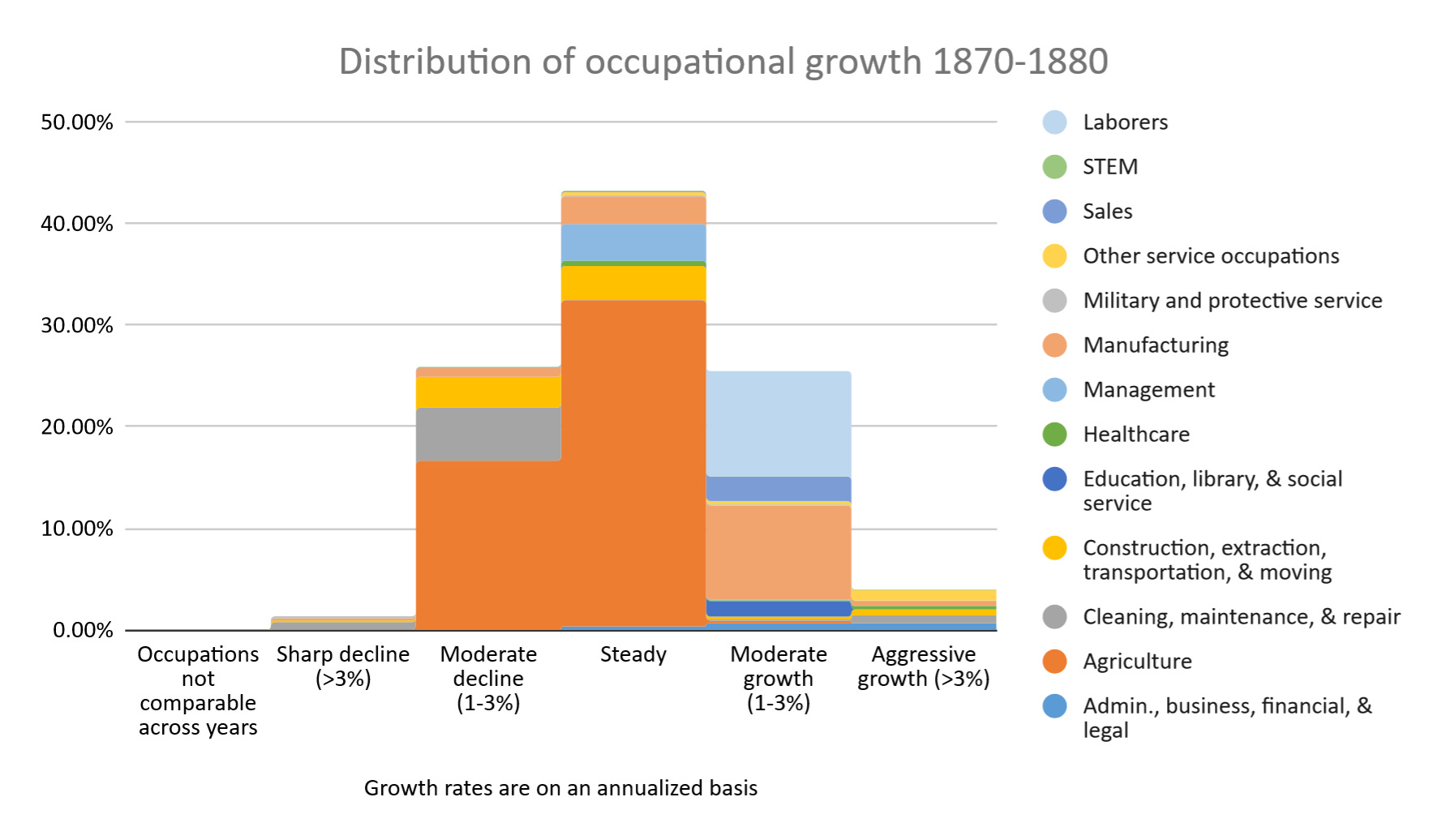
Remarkably we see this same pattern as far back as the 1870s, though with a lot more agricultural jobs and fewer extremes:
But some decades we see a flatter distribution, meaning unusually rapid change. The 1900s— the decade which Elvery identified as seeing the second most rapid change— was a great example of this:
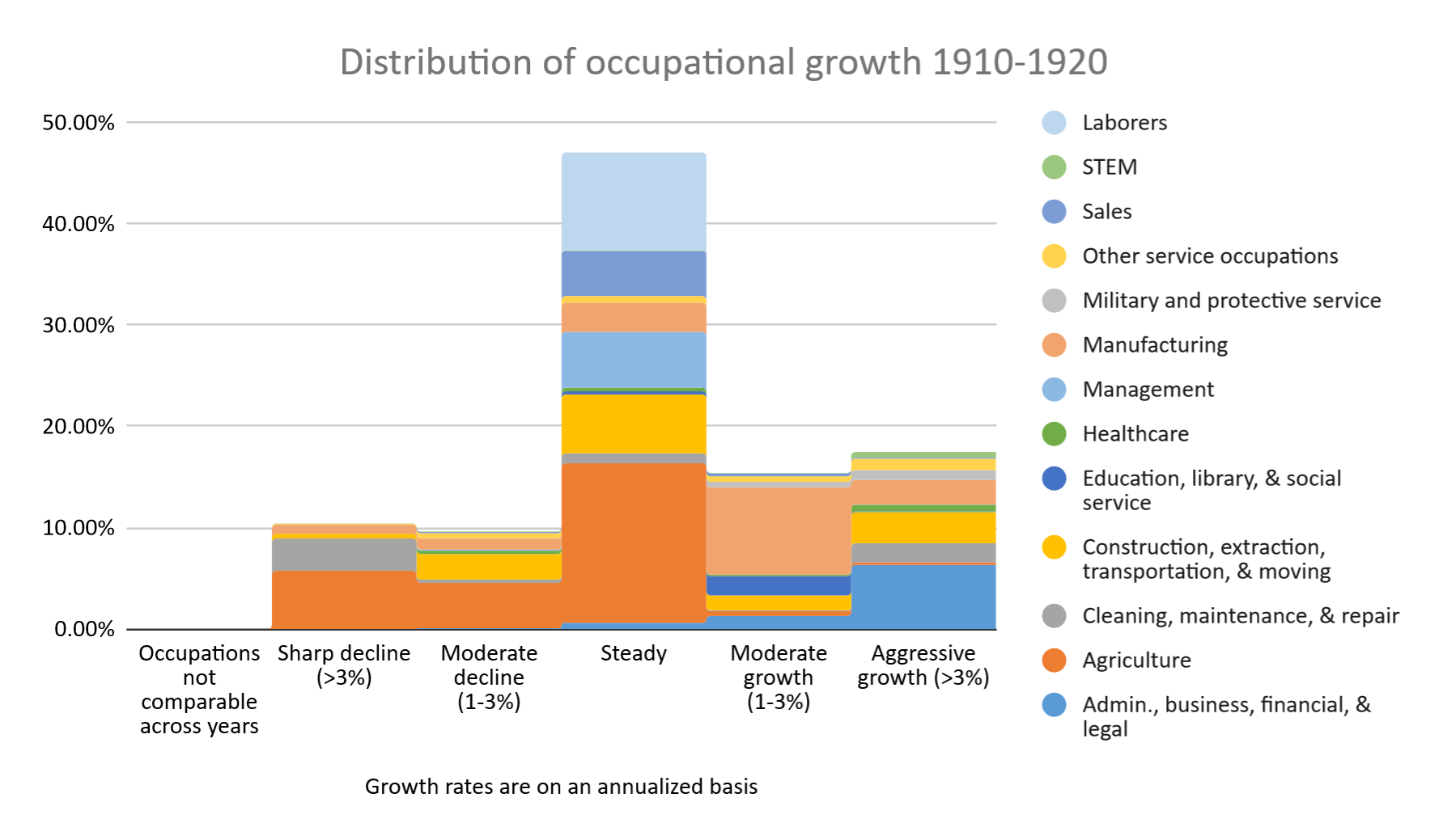
War decades are weird. The 1910s look a lot more stable in the middle but with more occupations on the extremes:
Meanwhile the 1940s show such a strong push out of agriculture that the middle of the distribution shifts into “moderate growth”. Elvery’s analysis has this as the decade with the most change (slightly more than the 1900s) but this chart reveals how different the change was.
Lastly, there was a similar, though less extreme distribution in the 1960s:
I would love to come up with an index that summarizes at a high level each decade’s pattern of job growth, and build this into a model that guesses at what sorts of shifts we might see from now through the year 2120. A question for my followers who are more versed in statistics: are there any metrics that could quantitatively describe these different sorts of distributions that you recommend I take a look at?
Another note: every year, the BLS publishes a forecast of how much job growth they are anticipating in each occupation over the next decade. They have been doing this since 2002, so we can compare the distribution they projected vs. the distribution that actually happened. My initial findings here have been quite intriguing, and I would love to connect with others who have done similar work. Looking forward to sharing more soon!