
Update from the war on tabs

After writing last month about creating a system of tags to better organize my knowledge, I felt “over the hill” in some ways: I had planned to just zip through all the tabs I had open over the next 6 weeks, file them away under the relevant tags, or discard them.
Unfortunately, it wasn’t that easy. There were a few aspects of this work whose difficulty I underestimated.
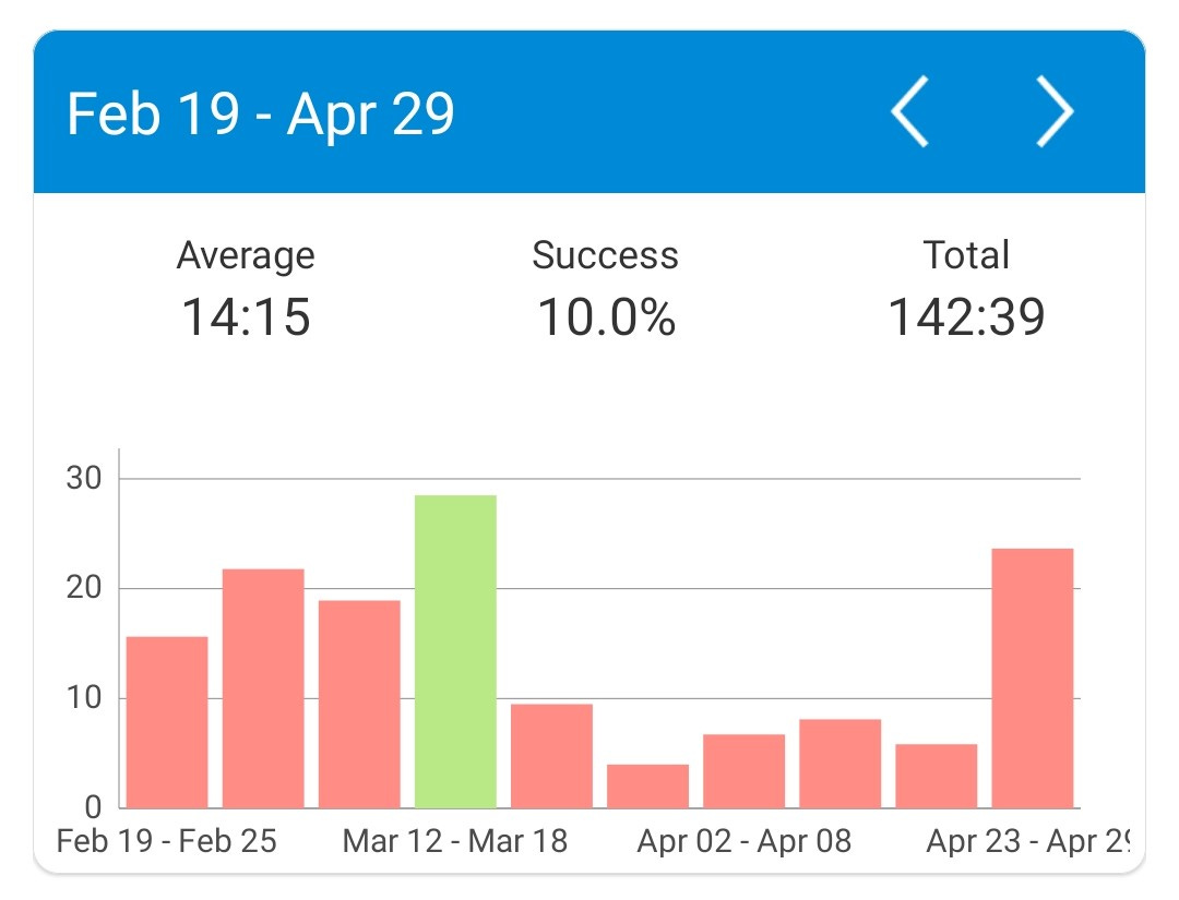
First, I just needed a break! I keep track of the hours that I spent working on this project, and after a few ~20 hour weeks of this (on top of working full time), I was feeling a bit burnt out.
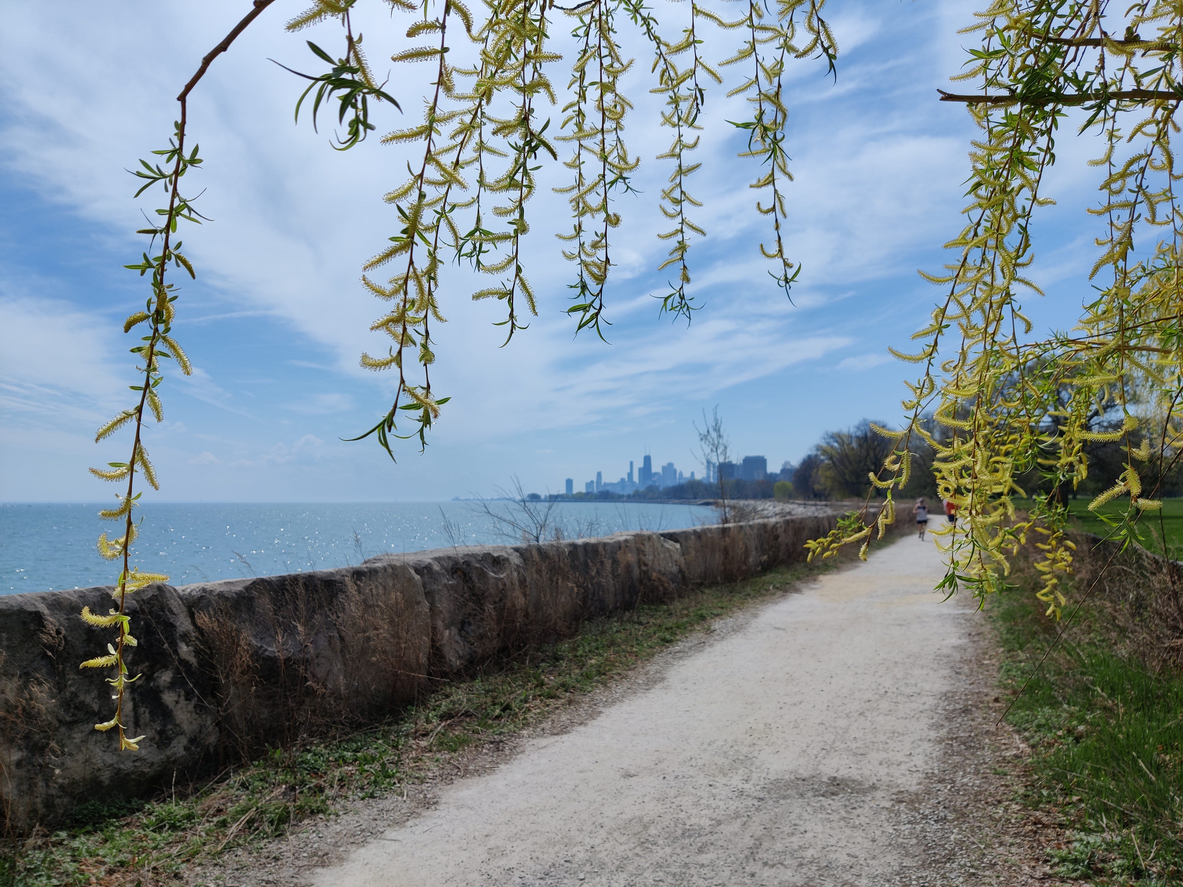
Taking in the sights of early spring in Chicago was restorative:
Second, I was surprised by how much the number of questions/tags in my database continued to grow. I still have way more tags than tabs.

In retrospect, this makes sense, as some of the most insightful articles I come across weave together some possible answers to many different questions.
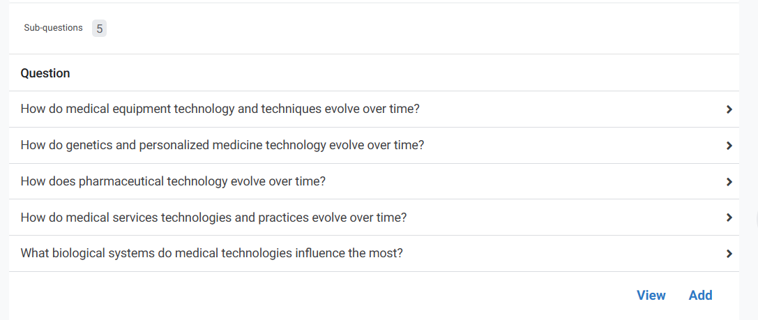
As I added more of these tags, I also had to be thoughtful about their hierarchy. After reading more, I had to update the ones I use to keeping track of different advances in medical technology. Ultimately, good research may intersect with sub-questions in a number of these larger groups.
Even more complex than coming up with categorizations for technologies is coming up with categories for social norms, philosophies, and other important social institutions. The ambiguities of where these concepts fit in I think is reflective of the difficulties we have at times in writing and conversing about some of these topics.

Keeping a close eye on how these change over time is central to predicting the future, but they are also hard to measure, making it challenging to do any utilitarian calculus about how much satisfaction or dissatisfaction changes in these might cause.

Lastly, some subjects are just plain interesting. The perennial question of “do we have free will” might best be described as a question about what the distribution of personal agency actually is.
Wealth inequality might be the most straightforward factor that shapes that distribution, but it’s far from the only one. Wealthy individuals can only make so many decisions directly by themselves. How much does the level of trust across society influence how much agency people have independent of their level of financial wealth? And this article made me wonder, how does AI scramble that equation? Most AI disaster scenarios assume agentic AIs of the future have direct access to a significant amount of money and resources. Do we have a way of measuring any increases in their access over time?
Returning to the future of the workweek, I also thought a lot about how much work time is spent doing other activities. This is of course a difficult question to survey. How many people, when asked “OK, how much time do you actually spend working” might not fully trust who was asking the question? Would they give them a rosier answer than the truth? Indeed, there is a predictable gap between the hours that workers claim to spend on work-related activities vs. what their HR departments think.
But finding good quality data to even get the link above was a challenge! Whether I used traditional Google or fancier AI tools, there was always a layer of results that either had not cited their sources or used very crude surveys to arrive at their questionable findings. Some of the best data sources I came across were sadly out of date: salary.com did a series of surveys between 2008 and 2014 but there have been no updates since. I hope to write about this in more detail in the future, synthesizing these older surveys with new ones that focus more on flexibility and remote work.
For now, I’ve designed a few new interfaces to better keep track of what I read and how it ties back to the bigger picture.
Building a better news feed
I look back to where I was a few years ago, before I started using Twitter. At that time I was much more in the dark about the details of emerging science and technology, and the nuances of economic data that might be most useful for predicting the future. Carefully building my follow list based on the research I am doing here was great way to hack the addictiveness of social media to my benefit. It gives me a good broad sweep of information, with the downside of being the source of my many still-to-be-filed-away tabs.
But what if I want to focus on a particular area and block out the noise? Could I create a "quieter” feed for myself using AppSheet?
I’m happy to report I was successfully able to build this! Here’s what it looks like:

I’ve essentially built my own algorithm here to resurface links that I had previously saved, based on both the questions each link is associated with, and the questions I’ve identified in my list of priorities. I’m able to highlight the importance of some links over others, and might make some other improvements later. But I am very excited to have these links and notes come up automatically based on whatever I’ve decided is important at the time.
A fresh look at priorities and expectations
Reading this piece on building a PARA system changed my thinking somewhat. (thanks again Kevin Zhai!)
I had developed a good system for managing projects and short-term priorities. But there are longer-terms areas of interest too, like learning skills, or finally closing out all of these damn tabs! I ended up breaking out two separate views for these in my app. But I really manage these most closely in the source spreadsheet:

This is very helpful for setting the right expectations, which I’ve struggled with. As I mentioned back in January, some of my earlier pieces took an incredibly long time which I only realized in retrospect when I went back and tagged them with their many related questions. The articles I have planned are much more targeted, which should in theory take less time.
As you might figure from all the numbers above, I’ve come up with a way to model the estimated difficulty of each piece, starting with the number of related questions. By default, these are multiplied by my best guess of how much time it should take to research each question (estimated depth of analysis), plus the overhead time it typically takes to write anything (~2 hours). I then divide by the amount of time I think I’ll have available per week while writing the piece to get the estimated timeline. These will update automatically if I change the number of questions, depth of analysis, or the estimated time per week I think I’ll have available.
The areas of focus compete with writing time, and this system takes that into account. I even have a chart in another tab which takes a look at the time I’ve currently committed myself to, everything included. I expect to slowly chip away at the ~600 remaining tabs I have open, finishing perhaps around mid-September while I work on other stuff.

I can also use this view to see how much research I’ve already done related to the questions (the squiggly blue area). This pre-saved research might make the writing easier, but it could also mean it’s a topic with a lot of complexity. With these expectations set, it will be interesting to see how close I get to them. It’s obviously a bit of extra work to do this, but having realistic expectations helps keep this effort sustainable. This visual is one of several designed to help me recognize the real progress I make each week despite the seemingly infinite goal.
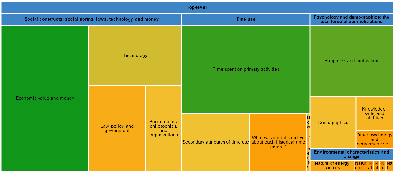
Another one of my visuals is a treemap. This has been enhanced from the last time I shared it— it now also tracks globally how much research I’ve done in some areas vs others. More research = green.
While I haven’t won the war on tabs yet, and there’s still lots of improvements to make to my knowledge management system, I’m excited to be well on the way, and to be able to keep track of multiple priorities simultaneously.
See you in 3 weeks for the return to our regular programming: my initial predictions about where the workweek might be in the year 2120!
Nice! The idea of using burndown chart to quantify your reading queue is a great idea for putting your reading in context with the rest of your work!