
Visualizing the future by playing with data
Sharing public versions of tools I built and use in my research

In thinking about how I might model out what our future looks like in the year 2120, I like to have visuals that can show me a breakdown of key variables at once over a long sweep of time. It’s very helpful for visualizing the full picture of what the possible trajectories might be.
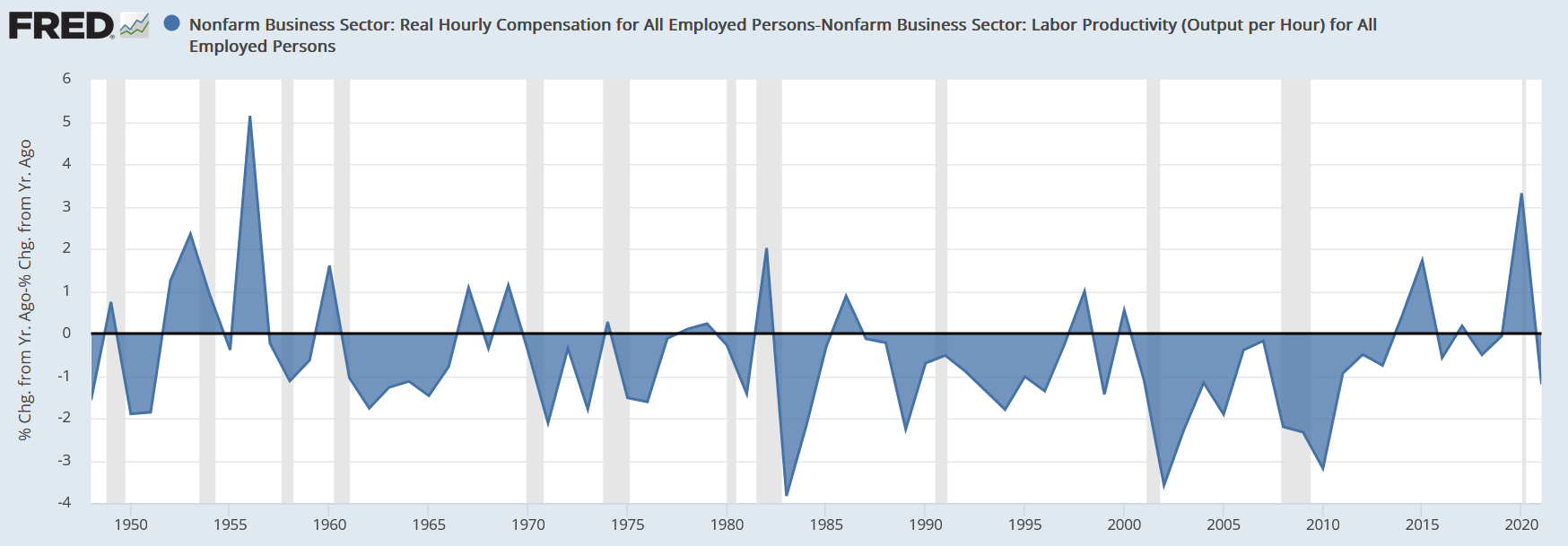
Sometimes, great tools exist already. This is particularly true for economic and financial data— The Federal Reserve Bank of St. Louis has a plethora of datasets in FRED which can very easily be combined and manipulated to make charts like these:
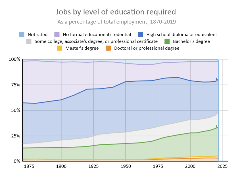
In other cases, datasets are amazingly comprehensive, but the visuals are lacking. This is particularly true of the occupational data from the Census that I have been working with over the past year, which I obtained from some moderately straightforward queries here (IPUMS login required).
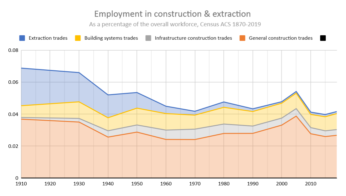
I hope to share the tool I use to generate these charts about jobs more publicly one day, but I was able to improve my Google Data Studio dashboard I shared a few weeks ago:
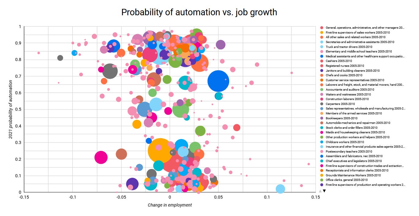
You can now make charts like these yourself here comparing employment growth, wage growth, hours growth, the probability of automation (as rated by willrobotstakemyjob.com), and the percentage change in the gender ratio of each job.
Make sure you select at least one filter though— I recommend starting with time period.
Oh, and one more thing…
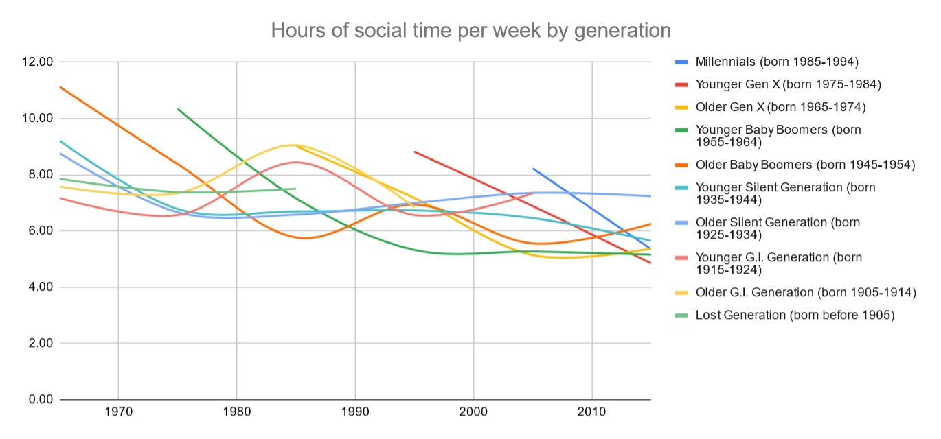
Sometimes, data is nigh inacessible to a non-technical user, or the summaries that are available are overly general. This has certainly been the case for data from the American Time Use Survey. But I am very excited to share a new Google Sheets tool I built which you can use to see what the average day looked like for a particular demographic slice over time.
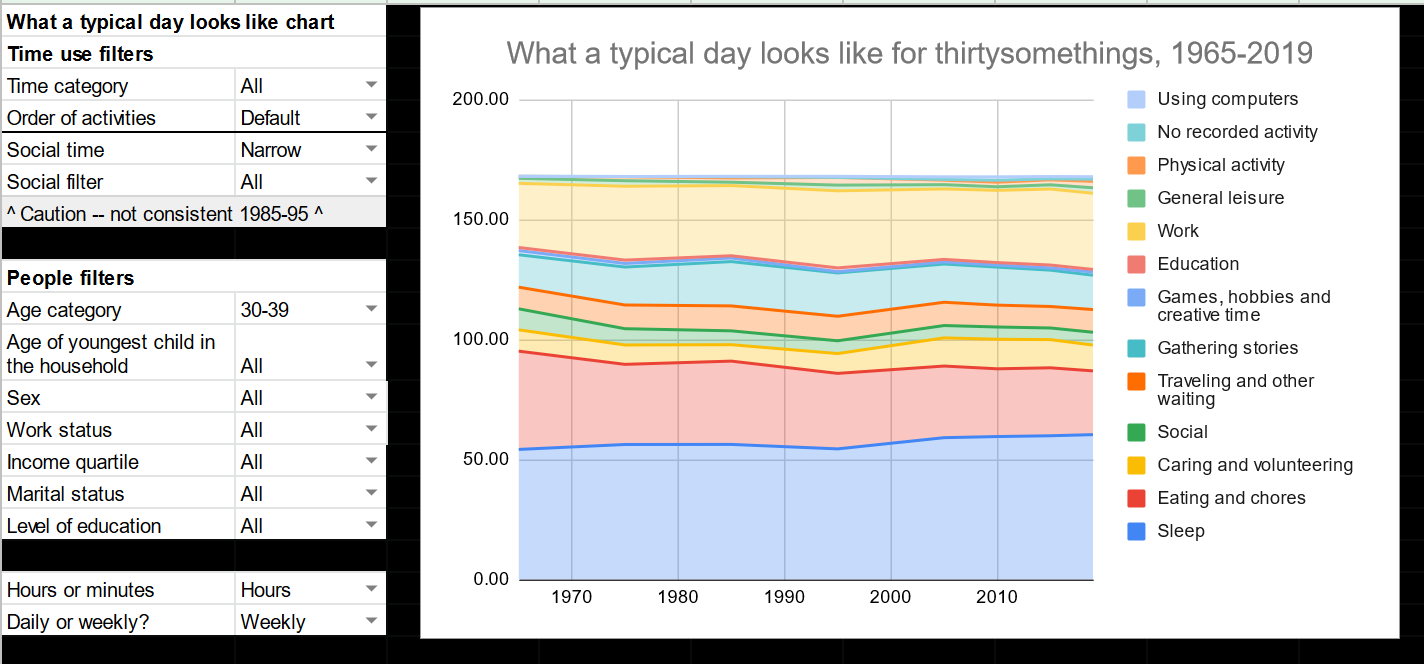
You can even see how much time your chosen demographic spends on a particular activity compared to other people, and how each generational cohort has differed with the passing of time!
I have really enjoyed playing with this tool. Economic data can sometimes be abstract and the possibilities over the course of 100 years can seem endless. But we will still have 24 hours in a day (at least on Earth!) in the year 2120, and it’s grounding to consider how we might ideally spend our time.