
Can you actually predict which jobs are going to grow or decline?
How do the BLS' 10-year projections fare over time?

Some of the most detailed predictions about the future of the job market come from the U.S. Bureau of Labor Statistics (BLS). Around the start of each school year, the BLS releases their employment projections for the next 10 years1, broken down by industry, occupation, educational attainment, and other demographics. They are often cited by guidance counselors and news outlets alike to inform people about which jobs are most likely to grow or decline. But how accurate have their projections been historically?
BLS has regularly published evaluations of their previous projections. In their most recent analysis of their 2012-2022 projections, they find that they correctly predicted whether or not an occupational group would grow or decline 77% of the time.
This sounds pretty good until you take a closer look. In an economy where the population and workforce are growing, it’s somewhat easier to get the overall direction right because a majority of occupations are likely to grow nominally. A more challenging test would evaluate how many occupational groups were correctly predicted to grow faster or slower than the whole workforce. The BLS does this too, and for 2012-2022, they were right 67% of the time. Knowing that a random guess should be about 50% right, their accuracy is only about one third of the way between a random guess and a perfect prediction.
However, knowing the direction is only one part of making an accurate prediction. There is a world of difference between an occupation where employment only declines by only 1% and one that sees a dramatic 50% drop. The metric that the BLS uses to evaluate accuracy in this regard is a comparison of the sum of absolute differences. In other words, they compare which prediction is closer: their detailed one, or if they had instead assumed all occupations would simply grow with the size of the total workforce. For 2012-2022, their sum of absolute differences was 17.1, slightly lower (and better) than the naive (default) assumption of 17.8. This metric isn’t a technically expressible unit, but it is similar to how one might measure the total percentage difference between the original and forecasted mix of jobs vs. the actual mix for the forecasted year.
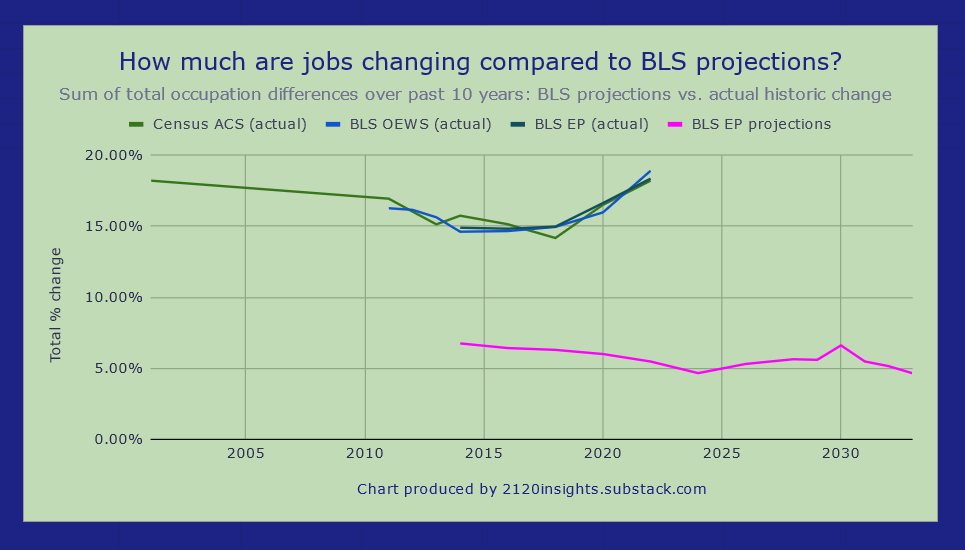
A few months ago, I wrote about how this percentage could be a more precise way to measure how much the nature of work has changed in each decade going back to 1870. I used the same approach for BLS employment projections back to 2004-2014: measuring how much aggregate change actually happened2 for each set of projections, and how much the forecast beat a naive (default) assumption that employment in each occupation would remain the same over the next 10 years.
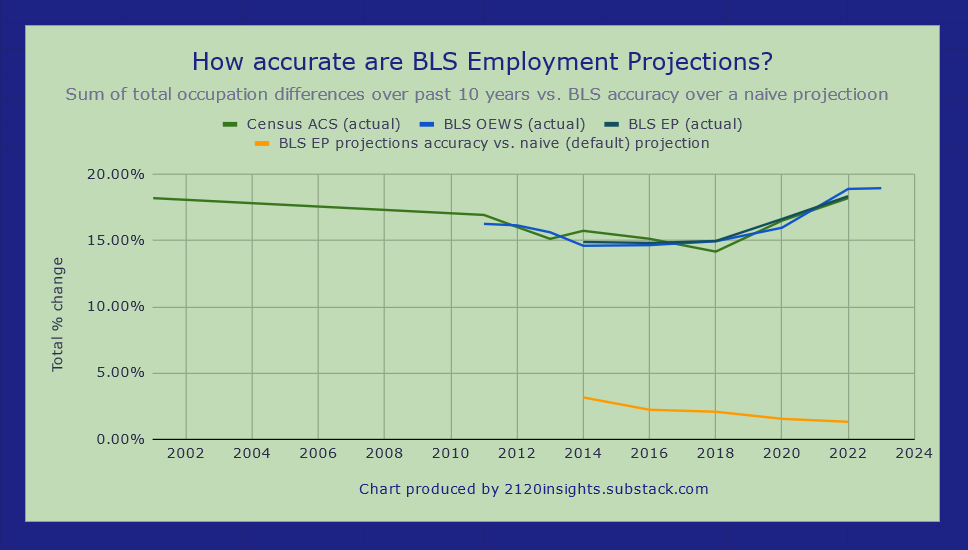
The BLS does a little better using this metric, with a 1.3% difference in 2012-2022 rather than 0.7, but there is a worrying trend: BLS forecasts are inching closer towards being less accurate in the aggregate compared to the default assumption of employment remaining completely unchanged. And while we might have expected the 2010-2020 projections to have been off the mark due to the pandemic, the 2012-2022 ones are actually even further off.
Of course, this doesn’t mean that we should just assume little change out of an abundance of caution, or that it is impossible to predict with any accuracy where jobs will grow or decline next. Indeed, a key flaw in BLS occupational projections is that they are far too conservative! I have alluded to this in some of my previous work, but I’ve finally done a more complete analysis here. If we imagine how much occupational change the BLS forecasts estimate vs. how much happened historically, we see that their forecasts only capture about one third of the actual change (and possibly less heading into the 2020s).
That said, when the BLS does make a bold prediction about a particular occupation, it’s often right. This has been particularly true of predictions about healthcare-related jobs, which makes sense given reliable demographic projections. This is perhaps most readily seen in a comparison of bell curves between 2012-2022 projections vs. actuals.
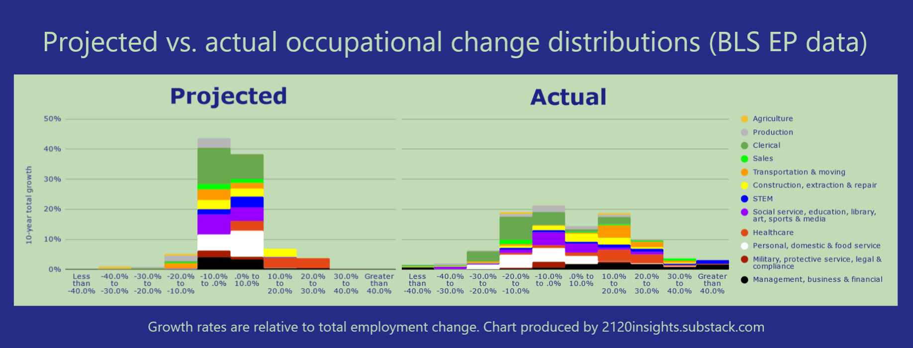
On the other hand, the BLS’ most consequential miss of the 2010s was underestimating the impact that the rise of online ordering would have on the job market. This is a major component of the rise in “Transportation & moving” occupations3. Relative to employment growth, stockers and order fillers were predicted to decline by 11%. Instead, they increased by 17%. On the other hand, a 1% decline was predicted for retail sales workers, but this decline actually amounted to 19%! Correctly predicting growth in these two occupations alone would have improved overall accuracy by 1.35%, doubling it relative to the naive status quo prediction.
Based on the information available in the summer of 2013 when the BLS made these 2012-2022 projections, could they have realistically anticipated how much online ordering would shape the job markets in retail trade and logistics? To what degree is the evolution of technology and its impacts on the job market inherently unpredictable? How might recent advances in technology have shifted this years’ predictions relative to last years’, and what advances are being overlooked?
I look forward to digging into these questions over the coming month!
The projections cover a 10-year window but technically only look 9 years into the future. For example, estimates of 2023 employment by detailed occupation don’t become available until 2024, so projections released in 2024 only cover the 10-year period between 2023 and 2033.
There are three different lines measuring actual change here, reflecting the uncertainty of measuring actual employment in occupations. Census estimates are from the ACS 1% sample as aggregated by IPUMS USA and are a bit noisier but detailed demographic information is available for the surveyed individuals. BLS OEWS estimates like this one survey employers and capture more detailed occupations, but don’t accurately capture occupations where there is a higher rate of self-employment. Current-year estimates from BLS’ Employment Projections team appear to synthesize information from both of these approaches to provide a best-guess estimate of total employment for each detailed occupation. These are used in BLS’ Occupational Outlook Handbook and can help us answer the question of how many people actually make a living from music.
The total aggregate change measured (based on the more comparable-over-time “Post-1990” categories that I have outlined here) is nearly the same across the three different approaches.